Quick Start: Visualizing Blast Motion Data in Power BI Desktop
- Benny Rodriguez

- Dec 30, 2019
- 7 min read
As we stated on our previous post (see that post here), Microsoft's Power BI Desktop is a free application you can install on your local computer that lets you connect to, transform, and visualize your data. With Power BI Desktop, you can connect to multiple different sources of data, and combine them (often called modeling) into a data model that lets you build visuals, and collections of visuals you can share as reports.
In this post we do a quick intro to Power BI Desktop for visualizing Blast Motion sensor data, not intended to be an all exhaustive course but more of a quick start that will allow anyone to bring their own data to Power BI for their own exploration, analysis and visualization.
Prerequisites
If you would like to complete the steps in this article, you need the following:
Download and install Power BI Desktop, which is a free application that runs on your local computer. You can download Power BI Desktop directly, or you can get it from the Microsoft Store.
Download the sample CSV File, and create a folder where you can store the file. Subsequent steps in this quickstart assume that you know the file location for the CSV file.
Launch Power BI Desktop
Once you install Power BI Desktop, launch the application so it's running on your computer. You're presented with a welcome screen with links to tutorials, forums, blogs and news. Click this away to start with a blank canvas, which is where you create visuals and reports from data to which you connect.

Connect to Data
With Power BI Desktop you can connect to many different types of data. You can connect to basic data sources such as a Microsoft Excel files, CSV files, and SQL Servers and many more sources. To connect to the data, from the Home ribbon select Get Data.
Where you can choose from the many different data sources to which Power BI Desktop can connect. In this quick start we use the CSV File that you downloaded, described in the Prerequisites section at the beginning of this article. Since this is a CSV file, we select Text/CSV.

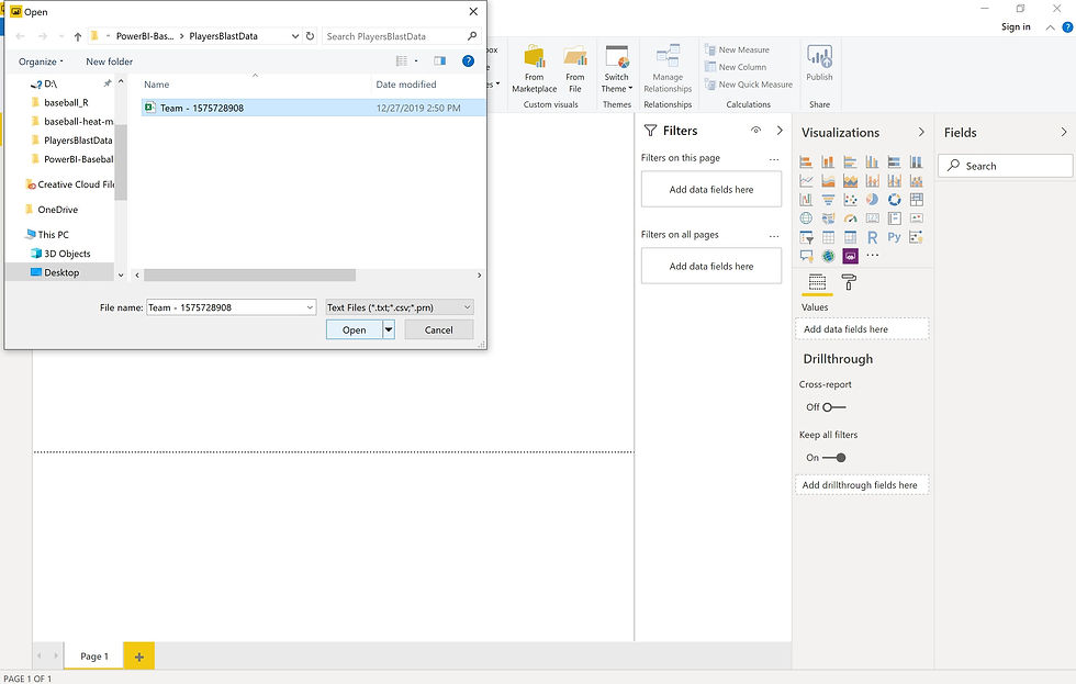
We're prompted to provide the location of the CSV file to which we want to connect. We want to select the downloaded CSV file and then select Open.

Power BI Desktop then loads the file and reads its contents, and shows you the available data in the file.
Shape the Data
Now that you're connected to a data file, you can adjust the data to meet your needs. To shape data, you provide Power Query Editor with step-by-step instructions for adjusting the data while loading and presenting it. Shaping doesn't affect the original data source, only this particular view of the data.
Shaping can mean transforming the data, such as renaming columns or tables, removing rows or columns, or changing data types. Power Query Editor captures these steps sequentially under Applied Steps in the Query Settings pane. Each time this query connects to the data source, those steps are carried out, so the data is always shaped the way you specify. This process occurs when you use the query in Power BI Desktop, or when anyone uses your shared query.
Click on Transform Data so we can make some modifications to the data that is going to be imported to Power BI Desktop.

The Power Query Editor screen will show up, select Remove Top Rows from the Remove Rows menu. You are going to be asked to specify the number of rows to remove, in this case we want to remove the top 7 rows to end up with a data table with the extra info at the top of the file.

After that we would like for Power BI Desktop to take the first of the remaining rows as the header for the data table. We can do that from the Transform ribbon by selecting Use First Row as Headers.

Once this is done then we want to rename the Equipment column to Player Name by double clicking on the column name. Note: In the file we are using the same Balst Motion sensor was used and the players where identified by the bat (equipment) used.

Once you've made all the modifications necessary to the data, you can go to the Home ribbon of the Power Query Editor and select Close & Apply to import the data into Power BI Desktop.

View Data in the Fields Pane
Once you've loaded the data table, the Fields pane shows you the data. You can expand the table by selecting the triangle beside its name. In the following image, the table is expanded, showing each of its fields.

Build the Reports
In Power BI Desktop Report view, you can build visualizations and reports. The Report view has six main areas:
The ribbon at the top, which displays common tasks associated with reports and visualizations.
The canvas area in the middle, where visualizations are created and arranged.
The pages tab area at the bottom, which lets you select or add report pages.
The Filters pane, where you can filter data visualizations.
The Visualizations pane, where you can add, change, or customize visualizations, and apply drillthrough.
The Fields pane, which shows the available fields in your queries. You can drag these fields onto the canvas, the Filters pane, or the Visualizations pane to create or modify visualizations.

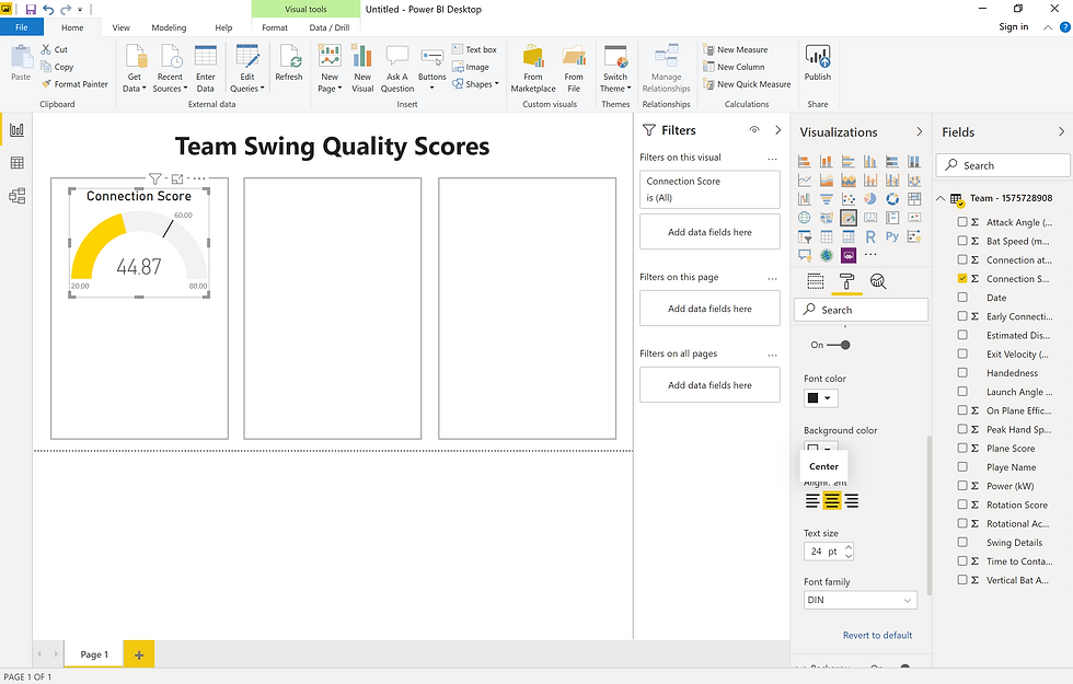
To create a simple report, let's start by inserting some text by selecting Text Box from the Ribbon. In the text box let's write "Team Swing Quality Scores".

Next let's insert some rectangular shapes by selecting Shapes then Rectangle from the Ribbon. Let's turn off the fill and make the border gray. Then copy and paste two more rectangular shapes.

After the rectangular shapes, let's select a Gauge from the Visualizations pane. Drag the Connection Score field onto the value field of the gauge visual. Make sure you use the average of the Connection Score.

Rename "Average of Connection Score" to "Connection Score."

Select the paint roller icon to open the Format pane. Expand Gauge axis and enter values for Min, Max and Target to 20, 80 and 60 respectively.

Still under the Format pane, expand Data Color and select Conditional formatting for the Fill.

Select Red, Yellow and Green as the colors for Minimum, Center and Maximum. Additionally, enter 20, 50 and 80 as the values for Minimum, Center and Maximum. Make sure that Diverging is selected.

Under the Format pane, expand Title and center the visual title.

Copy and paste the Gauge visual and replace the Connection Score field for the Plane Score field and Rotation Score field.

Select a Card from the Visualizations pane. Drag the Early Connection field onto the field of the gauge visual. Make sure you use the average of the Early Connection.

Repeat this and create cards for Connection at Impact, On Plane Efficiency and Rotational Acceleration.

Rename "Page 1" as "Team Swing Quality" then duplicate the page.

Rename the new page as "Player Swing Quality" and replace the text box with Table from the Visualizations pane. Drag the Player Name and Date (use the count of Date) fields onto the values of the Table visual.

Rename "Count of Date" as "Total Swings" and select the paint roller icon to open the Format pane. Expand Style and select Bold header to change the table style. Additionally, expand Column Header and Values to change the text size value to 20 pt.

Select a Slicer from the Visualizations pane. Drag the Player Name field onto the field of the slicer visual. This will allow for selecting which player data we want to see.

Select the paint roller icon to open the Format pane. Expand Single Select and turn it on. You can also change the text size in Slicer header and Items.

Change the slicer type, with the slicer selected, hover over the upper-right area of the slicer, select the carat icon that appears, and choose Dropdown from the options. Notice how the slicer appearance change.

Duplicate the page "Player Swing Quality" and rename the new page as "Player Impact Metrics." On the View menu select Sync slicers. The Sync slicers pane appears between the Filters and Visualizations panes. On the "Player Impact Metrics" page of the report, select the Player Name slicer. In the Sync column of the Sync slicers pane, select the "Player Swing Quality" and "Player Impact Metrics" pages. This selection causes the Player Name slicer to sync across these two pages making sure that we can see the data from the same player in both pages of the report.

Replace the Gauge visuals with more Card visuals and get rid of the rectangular shapes. We want to have cards for Bat Speed, Peak Hand Speed, Attack Angle, Vertical Bat Angle, Time to Contact and Power. Make sure you use the average of these quantities.

With one of the Card visuals selected open the Format pane. Expand Border and make the border gray and the radius 10. Then repeat for the rest of the Card visuals.

This will make the "Player Impact Metrics" page to look similar to this.

At this point we have a report composed of three pages that summarizes for us the team overall swing quality and let us take a look at a summary of how each player is doing.
Conclusion
In this quick tutorial, we’ve got acquainted with Power BI Desktop, a powerful tool and comfortable environment for data visualization and analytics tasks. We learned how to create simple report from Blast Motion data and how to use and modify some of the visuals to suit our needs.
This information pretty much help with the general usage of Power BI Desktop, but there is more that can be done. Other great functionalities are relationship management, custom visualizations and a whole variety of tools available.
You can learn more about using Power BI with its Guided Learning materials and YouTube channel.
We encourage you to play with the files we shared and see what reports you can come up with. Feel free to share with us the ideas and reports you came up with by commenting in this post or reaching out on Twitter (@batcavehitting).


https://www.excelr.com/data-analytics-certification-training-course-in-bangalore/
Attend The Data Science Courses From ExcelR. Practical Data Science Courses Sessions With Assured Placement Support From Experienced Faculty. ExcelR Offers The Data Science Courses.
<a href="https://www.excelr.com/data-science-course-training-in-bangalore"><b>ExcelR Data Science Courses</b></a>
<a href="https://www.excelr.com/data-science-interview-questions"><b>Data Science Interview Questions</b></a>